Enersee
A mobile app concept that simplifies household energy consumption data through intuitive visualization and actionable insights. Designed to help users understand not just how much energy they use, but what they use it for and where it comes from — turning invisible consumption into transparent, behavior-changing information.
Role
UX/UI Designer
Team
1 Designer + 2 Researchers
Duration
8 weeks

My responsibilities:
– UX research & competitive analysis (energy apps, smart home interfaces)
– User persona development & scenario mapping
– Low to high-fidelity prototyping in Figma
– Usability testing (2 rounds: 4 tests + 3 follow-up tests)
– Final UI design following Material Design guidelines
Project overview:
Despite the availability of smart meters and energy feedback technology, consumers remain disengaged with their energy usage. The problem isn't lack of data — it's that existing tools fail to make that data meaningful. Energy consumption has become increasingly invisible: we don't see coal burning or water flowing through turbines; we just flip a switch. Enersee is a mobile app concept designed to make energy consumption visible again through clear visualization, personalized insights, and actionable recommendations. The goal was creating an interface simple enough for daily use while providing enough depth to drive actual behavior change. The project was conducted over 8 weeks as a UX design exercise exploring how to translate complex energy data into intuitive, user-friendly interfaces.
Research & problem definition:
Our desk research focused on existing energy visualization tools, smart home apps, and academic literature on energy behavior. We found that while technology exists to track consumption, most interfaces overwhelm users with raw data (kilowatt-hours, graphs, numbers) without context or actionable insights. Key insight from Frey & Schädler (2021): although energy consumption has massively increased, it has also become more invisible to users. We analyzed competitor apps and identified recurring failures: overly technical language, lack of comparative baselines (is 50 kWh good or bad?), no connection between consumption and specific devices, and missing guidance on when to act. Our research led to a core design principle: energy awareness should clarify three things: how much energy we use, what we actually use it for, and where the energy comes from.
Target user needs & personas:
We developed a primary persona: the 'Finance Expert' — a household decision-maker motivated by cost savings and efficiency rather than environmental activism alone. This persona cares about optimization, wants clear ROI on behavior changes, and appreciates data-driven insights presented in a no-nonsense style. User needs emerged from research and interviews: (1) easy-to-understand and informative interface with no overly complex information, (2) tips for specific use cases (when to run the dishwasher, which appliances consume most), (3) clear time spans indicating when to turn devices on or off (e.g., based on tariff rates), (4) simple calls to action that don't require constant attention, and (5) consumption must be made comprehensible through comparison (to past usage, similar households, or benchmarks). These needs became our design requirements.
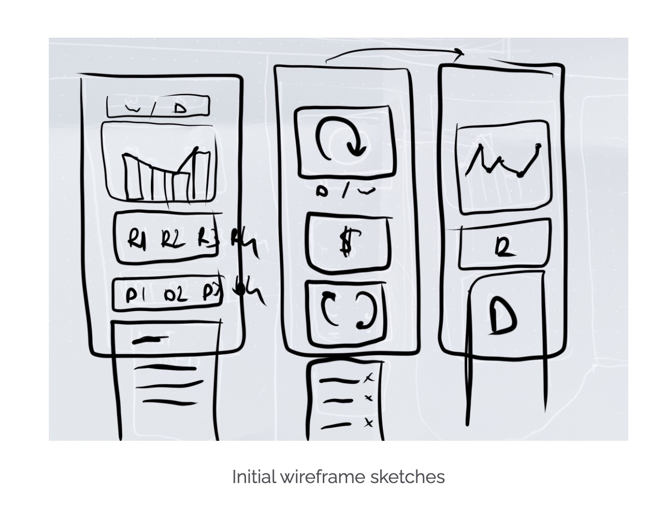
Initial design & failure points:
Our first prototypes failed at communicating the intended functions. We designed screens showing energy consumption by room, device breakdowns, and historical trends — but testers found them confusing. The main issues: iconography wasn't intuitive (users didn't understand what represented what), comparison baselines were unclear (numbers without context), and the navigation structure buried actionable insights too deep in the interface. Since our aim was creating an intuitive and universal interface for energy visualization, we had to test and rethink our approach. This taught us that even well-intentioned data visualization can fail if it doesn't match users' mental models. We learned that 'more data' doesn't equal 'more understanding' — and that the most important information should be immediately visible, not three taps away.
Usability testing — Round 1:
We created a high-fidelity prototype in Figma and conducted four usability tests with colleagues matching our target demographic. We used think-aloud protocol, asking participants to complete key tasks: check today's consumption, identify which device uses the most energy, and find recommendations for reducing usage. The findings were humbling. Participants struggled with the device breakdown screen (icons were ambiguous), didn't notice the comparison to previous months (visual hierarchy issue), and found the recommendations page but didn't understand how the tips were prioritized. The primary takeaway: our interface assumed too much energy literacy. We needed clearer labeling, stronger visual hierarchy, and more explicit guidance on what actions to take.
Iteration & Round 2 testing:
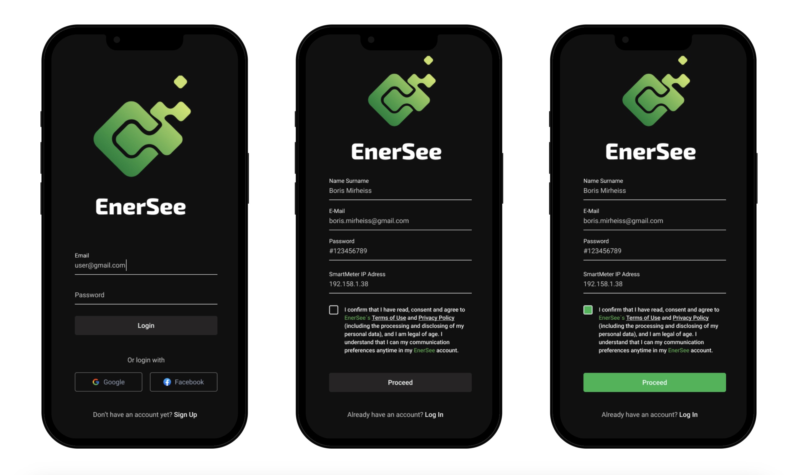
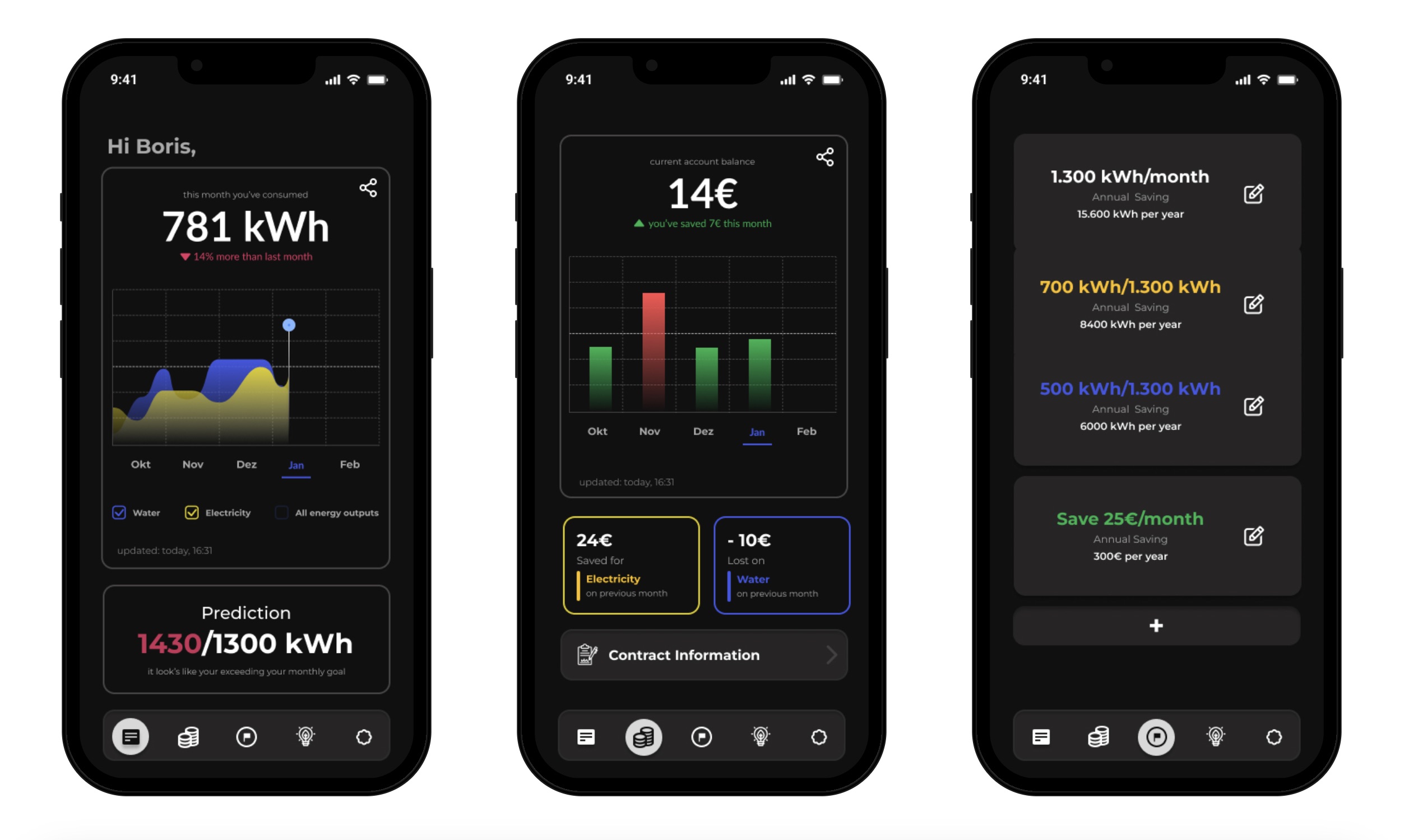
Based on Round 1 findings, we made three major changes: (1) replaced ambiguous icons with labeled categories (Heating, Appliances, Lighting, etc.), (2) introduced a prominent comparison card on the home screen showing consumption vs. last month with color-coded indicators (green = lower, red = higher), and (3) redesigned the recommendations section to prioritize high-impact actions with estimated savings. We conducted three follow-up usability tests. Performance improved significantly: task completion rates increased, time-on-task decreased, and subjective satisfaction scores were higher. Participants commented that the revised design felt 'clearer' and 'more actionable.' However, we also identified new issues: some users wanted to set consumption goals, and others requested notifications for unusual spikes in usage. These became backlog items for future iteration.
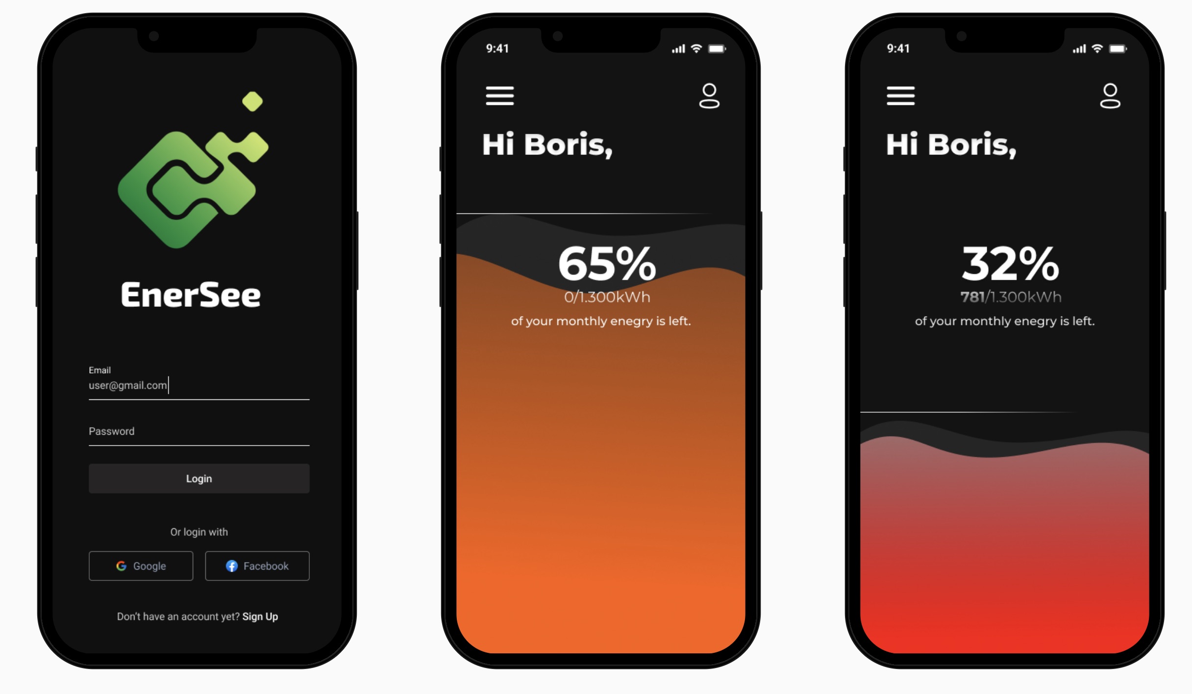
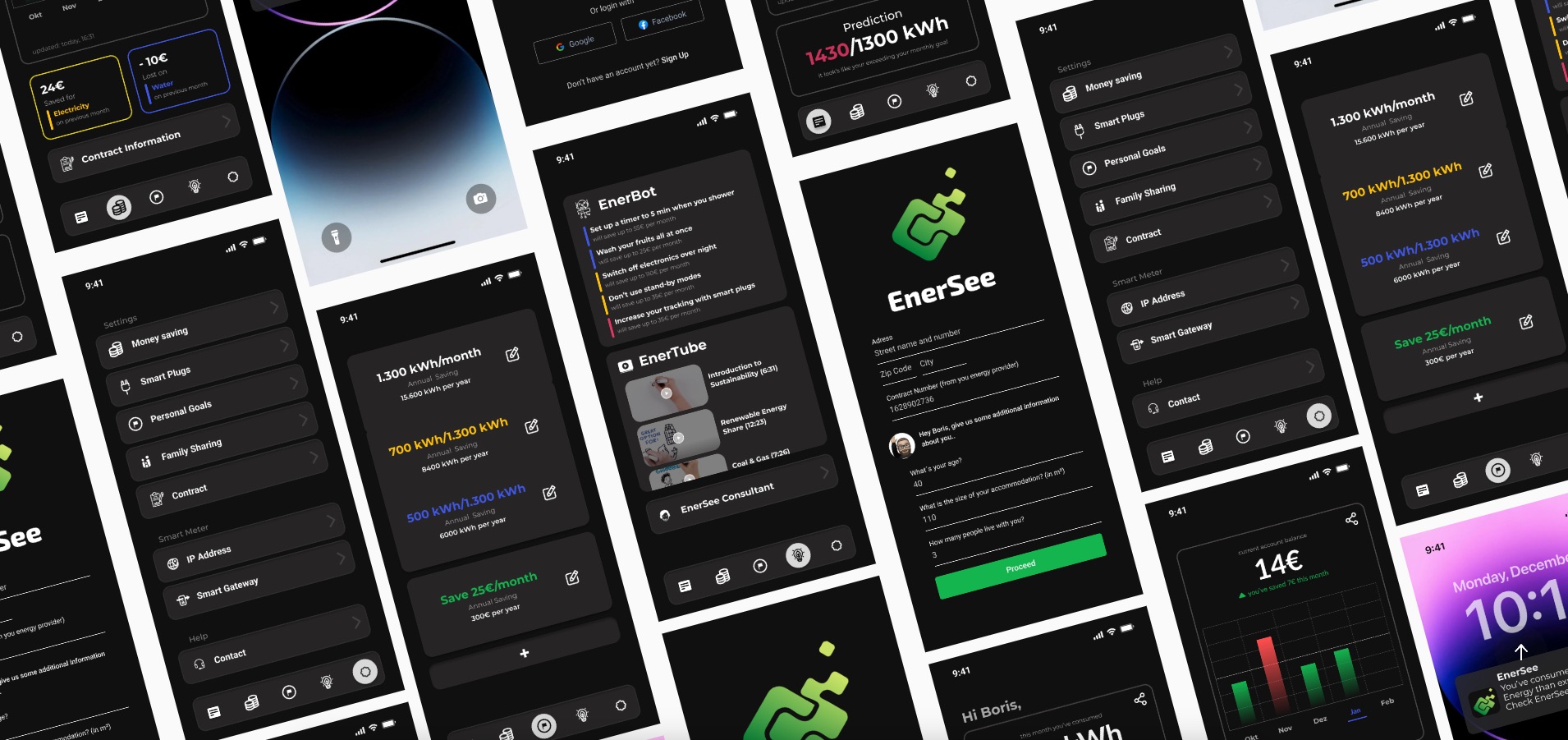
Final UI design & rationale:
The final design uses a corporate-style dark mode aesthetic to align with the 'Finance Expert' persona — conveying professionalism, data-driven decision-making, and a focus on efficiency rather than playful eco-branding. We followed Material Design guidelines to ensure the interface felt contemporary and familiar to Android users. Color coding was used sparingly but meaningfully: green for positive (reduced consumption), red for alerts (spikes or inefficiencies), and neutral grays for informational content. Typography prioritized readability with clear hierarchy: large numerals for key metrics (today's usage), medium weight for labels, and small text for contextual details. Every design decision was evaluated against the criterion: does this make energy consumption more understandable and actionable?
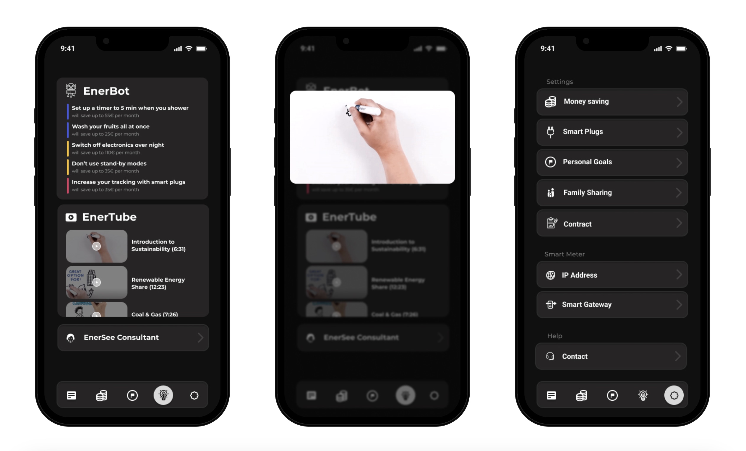
Key features & how they work:
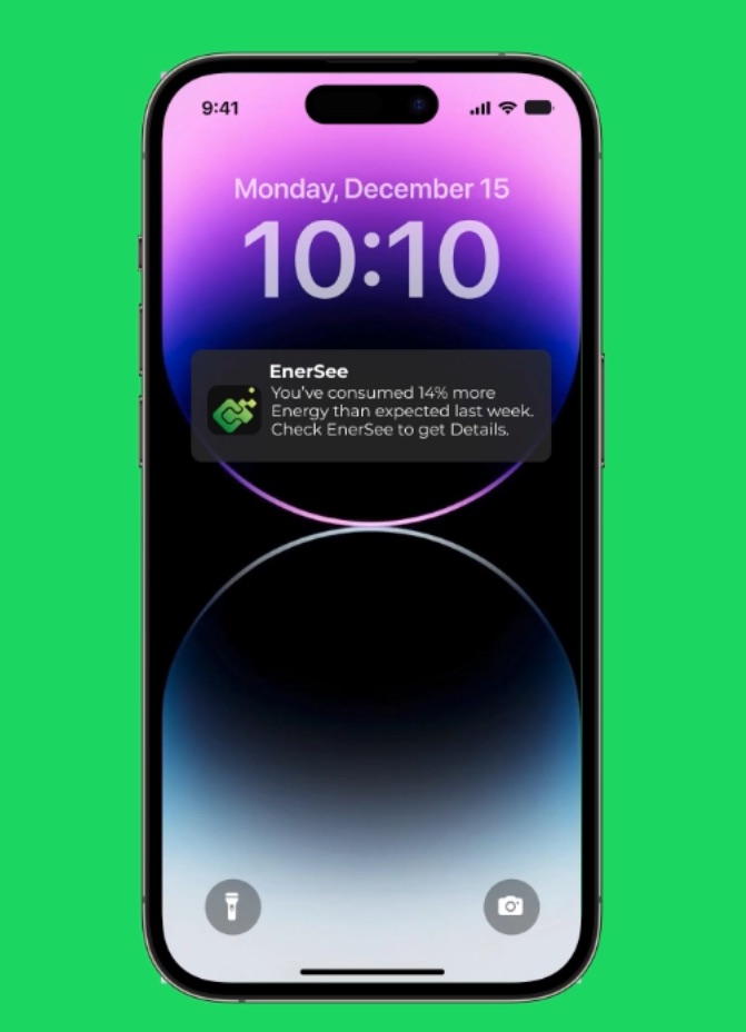
The final app concept includes four core features: (1) Dashboard — displays today's consumption, comparison to yesterday/last week/last month, and a cost estimate based on current tariff. (2) Device Breakdown — shows energy usage by category (heating, appliances, lighting) with drill-down to specific devices if smart plugs are integrated. (3) Insights & Recommendations — personalized tips based on usage patterns, such as 'Running your dishwasher at night could save €8/month' or 'Your heating is 20% higher than similar households.' (4) Historical Trends — weekly and monthly graphs with annotations for events (heat wave, vacation) that explain anomalies. The design emphasizes glanceability: the most important information is visible on the home screen without scrolling or tapping.
Outcomes & learnings:
Enersee was a conceptual project rather than a production app, so outcomes are measured by design insights rather than deployed metrics. The project taught us that simplifying complex data requires iterative testing — our initial assumptions about what users would find intuitive were wrong. We learned the importance of comparative baselines (showing consumption in isolation is meaningless), the power of actionable recommendations over passive data displays, and the challenge of designing for behavior change (which requires ongoing engagement, not one-time information delivery). If developed further, the design would benefit from extended user testing with actual energy consumers, integration with real smart meter APIs, and exploration of gamification or social comparison features to sustain engagement. The project demonstrated that good energy visualization isn't about showing more data — it's about showing the right data, in the right context, with clear next steps.
Next project